Supply/Demand Springs
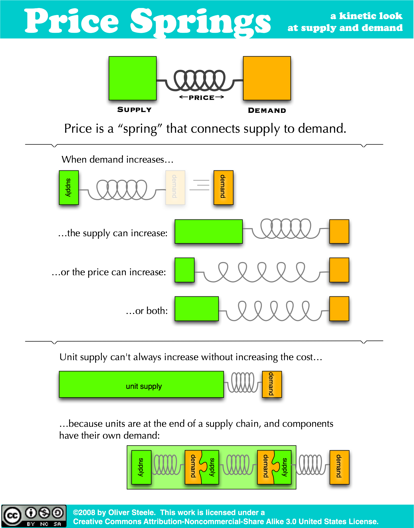
+Update+: This is what I call an entry-level metaphor – it’s a rough sketch of the relation between the concepts, not a productive metaphor that can be used to reason about them beyond this. It doesn’t support analytic microeconomic analysis, and it’s not even consistent at the level of the supply chain. (For example, the unit cost needs to include the component cost, whereas the illustration shows these as complementary; this is because the metaphor leaves out profit.) Nonetheless, I find it a helpful starting point before going more analytic.
It popped into my head when I was answering my son’s question about what “supply and demand” meant. (He had run across it in a Newsweek article he’s reading in his history class.) It seemed to work for him, so I decided to write it down here. We’re both so used to talking about images in words that I didn’t realize until I made this that I’d never actually put it on paper!